duSentio
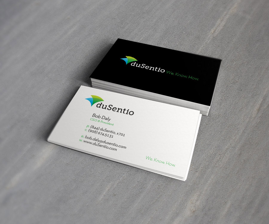
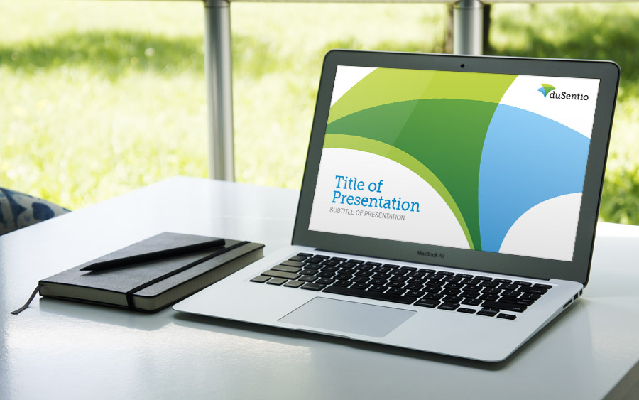
duSentio approached me to help brand their startup, specifically their logo. They wanted to make sure the logo communicated that they seamlessly connect 2 things - research and software. By overlapping 2 shapes, one representing research and one software, I was able visualize the creation of one unified solution. The icon, reminiscent of flapping wings, signifies duSentio’s ability to get clients’ needs off the ground and into action. The slab font coupled with the icon gives a technical, yet friendly feel. duSentio was very pleased with the range of concepts and loved the end result.